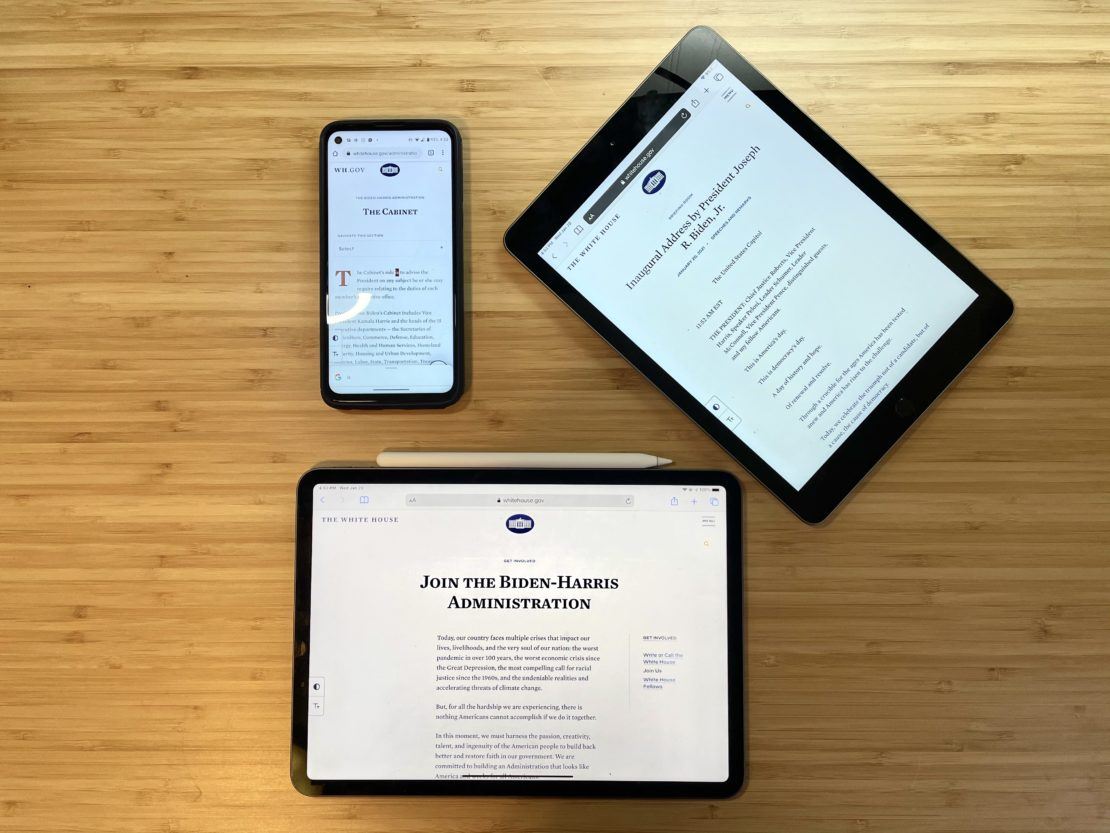
With the change of administrations comes a new website, and this morning the all-new Whitehouse.gov debuted. Like its predecessor, the site is powered by WordPress – but this version carries many differences and modern out-of-the-box features that we’re glad to see used on a site of this magnitude.
Dave Amirault, Pagely’s Director of Marketing, and Jeff Matson, Minister of Propaganda, have had a few moments to gather their first impressions of the site.

Dave –
The Design
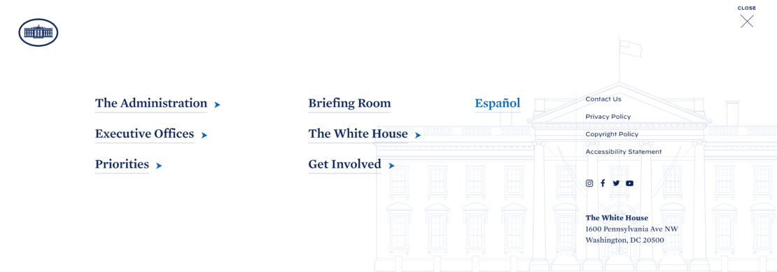
Personally, I’m a sucker for clean and focused designs, and the new Whitehouse.gov delivers on both those fronts. Images are clean, not overused and work to supplement the content on the page – not overtake it. The site’s navigation is simple and does its best to guide users through the site’s taxonomies.

Accessibility Features
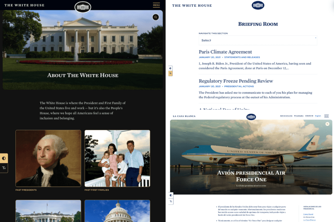
A website meant for the people should be able to be seen by all people, and Whitehouse.gov does a great job making the site’s accessibility capabilities front and center to users. As we all know, website accessibility is a source of constant improvement, and they even go so far as to address it in the site’s Accessibility Statement.
Notable Features
- High contrast mode.
- Large font size toggle.
- Spanish Translation


Easter Eggs
What’s a website in 2021 without an easter egg or two? Inspect the site’s source code and you’ll be treated with this recruitment message by the United States Digital Service.
Well played.

Matt Mullenweg found another easter egg that he posted about on his blog – go down the rabbit hole into the theme’s CSS file and you’ll find the perfect version number.
/*
Theme Name: The White House
Text Domain: whitehouse
Version: 46
*/
Jeff —
Heavy Usage of Gutenberg
By diving into the markup for the body content, we noticed that the Gutenberg editor is being used across the site. Although it does appear that custom blocks are being used in some places (a reference or two was found in the styles), it’s ultimately using standard paragraph and image blocks across the content.
Gutenberg doubters take note – the Gutenberg editor experience was chosen for a site of this caliber.

The WordPress Theme
Looking at the theme, it appears to be all custom built, although it may use a starter theme that I haven’t been able to identify.
Whatever is behind the scenes running in this theme, it’s well built, efficient, and accessible. At least looking at it from the front end, it’s a great example of what a WordPress theme should be.
The WordPress Plugins
It’s tough to tell what plugins are being used on this particular WordPress site, since the only assets being loaded are compiled into the theme and kept to a minimum. But there are a few different plugins that I was able to identify.
For creating and managing tables, the new White House site appears to be using TablePress. Thanks to the existence of sourcemaps and the naming on a few SCSS files, this one was identified fairly quickly. I wasn’t able to locate any places on the site where it was being used, but there are a few styles specifically related to it.
Edit: I’m hearing word that TablePress is not being used. When going back and checking the current styles on the site, I’m no longer seeing a reference to TablePress. It’s possible that it may have been left there accidentally and later removed.
During my research, I had saved the stylesheets/sourcemaps locally. Going back, I’ve confirmed that my eyes weren’t just playing tricks on me, and a Sass partial named components/_tablepress.scss is indeed present within the sourcemap. I’ve uploaded these files to this GitHub gist for future reference.
I was also able to identify that they’re using XWP’s Stream to log changes to the site, thanks to a comment in the source that jumped out at me.
By looking at the site’s sitemap.xml file, it appears that the new White House website is using the Yoast SEO plugin, presumably for things like meta tags, structured data, and sitemap generation.
I’m sure there are plenty of custom and off-the-shelf plugins running on the site for various different purposes. Maybe they’ll reveal themselves as time goes on.
CSS and JavaScript Framework Choices
By digging through the CSS and JavaScript files being loaded, we can see that a large portion of the site is built upon Bootstrap, jQuery, and Sass. Thanks to the wonders of sourcemaps, we’re able to look at each compiled stylesheet to see what’s going on under the hood.
Based on what we’ve gathered from the sourcemaps, Bootstrap is being primarily used for layout and responsive design purposes (Bootstrap Grid), although a few of Bootstrap’s other components may also be in use here.
Of course, before loading all of these styles, it’s critical that the styles are sanitized/normalized to keep things consistent across browsers. For that, they’re using sanitize.css, although an older version or possibly a fork, due a comment at the top of the file that is linking to 10up.
Everything is all compiled together nicely using Sass, with plenty of variables and mixins to make it all maintainable. Because of the focus on accessibility, Sass or another preprocessor like LESS is an absolute requirement. There are just so many accessibility-related styles here that would make it a nightmare to maintain without it.
Font Choices
On this fancy new White House site, they’re using 2 different web fonts: Mercury ScreenSmart for serif fonts and Decimal for sans serif. For the curious, here are the Sass variables.
Color Palette
As we mentioned earlier, there’s a huge focus on accessibility here. This really shows in their choice in color palette, with some options specifically targeted at different accessibility options.
The color palette is also another huge benefit that Sass provides here. Since the palette is all in variables, the accessibility variations are ready to be used as alternatives to the main palette at any time.

Standard Breakpoints
As far as breakpoints are concerned, there isn’t much here, other than the standard Bootstrap breakpoints. Although it does go to show that the breakpoints used in Bootstrap are what most sites should be aiming for as a best practice.
Newsletter Opt-In
At the bottom of each page, you’ll notice a newsletter opt-in form. This form (or at least the backend mailing list) appears to be powered by MailChimp. Whether they’re using a plugin to embed the form or it’s placed directly within the theme templates is unknown, but it’s certainly a MailChimp embed code with a custom form handler that goes to forms.whitehouse.gov.
Locking Down the WordPress REST API
A quick peek at the WordPress REST API endpoints shows that they’re locking it behind basic HTTP authentication.
My guess would be to drastically reduce the possibility that the REST API could be used in an exploit. If they’re not using it for anything, it makes sense to lock it down. Although it would be a nice way to consume content over other methods like RSS feeds or raw scraping of the markup.
Performance Monitoring and Browser Testing
In my look through the site, I noticed that in addition to the standard Google Analytics tracking that’s done through the US government’s analytics program (check it out – there’s some cool data there), they’re also using a couple of other browser testing tools.
The first of these is New Relic’s browser monitoring tool. Although there’s always the potential for evil in anything that’s watching your activity, the likely reason for this is for user experience testing. Especially on a fresh, new, accessibility-focused site that’s viewed worldwide with an infinite combination of variables, browser monitoring can be a critical asset for identifying any fixing issues.
The second is a similar and possibly related use of monitoring tools is Akamai’s mPulse real-time performance tracking. My best guess here is that they’re using mPulse for performance data, and New Relic Browser for UX data.
Theory: The Home Page Might Change After Inauguration Day (Confirmed)
Edit: This theory has been confirmed!
Thanks to a little bit of poking around the stylesheets, I noticed a partial named “_home-dayone.scss”. From this naming, it appears that the home page will be changing after inauguration day. We’ll just have to wait and see!
Wrapping Up
Overall, we’ve seen some great things from this new site. To name a few, we noticed:
- WordPress!
- Gutenberg blocks
- A highly-accessible custom theme
- A great color palette
- Utilization of some great WordPress plugins
- Testing tools that show a commitment to user experience
- Bootstrap, Sass, and jQuery
It’s great to see WordPress as the platform of choice for The White House, especially since the developers are taking advantage of Gutenberg. Will we see WordPress make its way into other prominent government websites? Only time will tell.
Political affiliations aside, I think we can all breathe a bit easier today knowing they didn’t choose Drupal.
As a caption for the High Contrast Mode,
you refer to whitehouse.ORG
In fact, it’s a high contrast !