Most people have optimized their site in one way or another, but have you ever done anything specifically for your mobile visitors?
In 2017, more traffic came from mobile than desktop, and that number is only going to grow. People are using their devices more and more, and they demand that you make it easy for them to access your site.
Many sites are not optimized for mobile beyond a simple responsive theme. Moving your site layout around for small screens is not enough to engage and convert your mobile visitors. You have to make sure your mobile site is fast, easy to use, and designed specifically for small screens.
Why should you care about mobile? According to Google, 61% of users are unlikely to return to a mobile site they had trouble with, and 40% would go to a competitors site. Even if people aren’t buying your product or service on mobile, you bet they are doing competitive research. If you miss the opportunity to engage with them on their device, you might lose them forever.
To ensure that doesn’t happen, it’s critical you work on your mobile user experience. Let’s look at 5 ways you can optimize your site today.
1. Speed Up Your Mobile Site
The most important thing you can do is speed up your site, so start there.
People expect sites to load quickly on mobile, especially when they are on the go. Faster load times can increase conversions and decrease bounce rates, while slow load times will send them to your competitors.
Here are 3 things you can do right now to speed up your site for mobile.
Reduce Images
Large images can slow down your page load times tremendously. The good thing is that it’s a pretty easy fix.
The first thing to do is look over your site pages, and get rid of any images that are not absolutely necessary. If your images are just to make your site look pretty, they probably aren’t converting your visitors. Try a/b testing with and without some of your main images, you may find that it makes no difference.
If the images have to stay, make sure to optimize any large images on your main landing pages. You can use a tool like Imagify, which also has a WordPress plugin. This tool will compress your images without losing quality, so your pages load faster but still look great.
Responsive images also help with load times, and lucky for you they are already in WordPress core since version 4.4. You don’t have to do anything to use those if you are up to date.
Optimize plugins and themes
Bad plugin and theme code can sometimes cause a bottleneck for your site speed, even if you optimize everything else.
If you are seeing a major slowdown, try to update all themes, plugins, and WordPress core. If that doesn’t fix the issue, deactivate plugins on a staging site until you find the culprit. You may also need to switch themes to one of the default WordPress themes, such as TwentySeventeen. Once you’ve found the problem, you can either leave it inactive, or attempt to diagnose the issue.
This can get fairly complex, but a great place to start is with HTTP requests, or wpdb queries. According to Pagely CTO Joshua Eichorn, these are the worst offenders they come across in supporting their hosting customers.
Another thing you can do is minify and concatenate plugin CSS and JS files. A plugin like WP Rocket can help with that; just make sure you contact your web host if you use a caching plugin. Some caching may be redundant in a hosting environment like Pagely’s that is already heavily optimized.
Use a great web host
You are reading this on Pagely, so chances are that you already have a great host.
If you are on a cheap shared hosting server somewhere else, simply upgrading your hosting account can do a lot. Managed WordPress hosts like Pagely have server infrastructure and caching in place that will speed up your site tremendously. They also allow for modern technologies like PHP 7, which is 4 times faster than PHP 5.4. Pagely also includes a CDN which can speed up your site images and other assets, and it’s very easy to use.
For more speed optimization tips, including a free PDF guide, check out this Speeding Up WordPress for Mobile article.
2. Don’t Stop at Responsive
Responsive design is important, but it’s not enough to simply purchase a responsive theme.
The problem is that a responsive theme is not enough. All it does is move your content around for small screens, but it doesn’t account for the fact that mobile users need to see different things than desktop users. I’m not saying you should remove features or content, it just needs to be designed more intentionally.
Responsive design, as we know it today is toxic to mobile conversion rates. – Joel Harvey
For example, if you have a restaurant website, mobile users probably just want to see your menu, hours, and how to get to your location. Desktop users may have the ability to scroll through more images of your site, read your blog posts, and opt-in to your newsletter, but you don’t want to bog down your mobile users with too much of that. If you just have a responsive theme, you are not able to intentionally show mobile users what they want quickly.
Designing an experience intentionally for your mobile visitors may require detecting devices on the server level, and designing a different experience for them in your theme. You can use the built-in wp_is_mobile() function to do that in your theme templates, which will go a lot further than rearranging columns with CSS.
3. Consider a Mobile App
At the beginning of the article, I mentioned that mobile internet usage has surpassed the desktop. The thing I didn’t mention is that most of the internet time on a device is spent in apps.
Apps account for 89% of mobile media time, with the other 11% spent on websites. – Smart Insights
Part of mobile optimization is designing a holistic mobile experience for your audience, and for many businesses that includes a native mobile app. Apps allow for a faster, more focused experience, as well as features that are not available on the web. For example, offline access and push notifications.
You can also distribute through the iOS and Android app stores, which gives you another point of contact to engage with your customers.
Many businesses can benefit from a mobile app to complement their website. There are lots of ways to create an app, including custom development or a DIY app builder. Custom app development is a great way to get an app built if you have the budget for it. App builders are a dime a dozen, but they don’t all integrate with WordPress on the same level. A tool like AppPresser focuses specifically on WordPress based websites, and can help you create an app affordably.
4. Avoid common SEO mistakes
Google offers some help to website owners who are working on improving their mobile SEO.
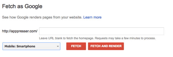
The first thing to do is fetch your site as Google to see if there are any issues you need to be aware of. You can do this through the Google Search Console here.

After you fetch your site as Google, it will show you any problems with your site that you need to fix.
You should also make sure you aren’t using a misconfigured robots.txt file or sitemap, which can block Google from accessing your site. Check for bad redirects or broken links, especially any that would only affect mobile. Using a plugin like Yoast SEO will also help you improve your SEO, as well as detect some errors.
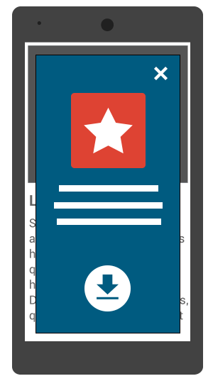
 If you are using a popup plugin or app download interstitial, make sure it doesn’t block the whole screen on mobile. Instead, use a less intrusive banner, or deactivate popups for mobile.
Your font size should be legible on mobile. I prefer a large mobile font of 16px. Your long-form articles should be one-column with no sidebars on a small screen. Also make sure any buttons or tap targets are at least 44px high, which is the desired size according to Apple.
Read more of Google’s recommendations in the full guide here.
5. Track your progress
If you go through all the work of optimizing for mobile, make sure you track how well you are doing.
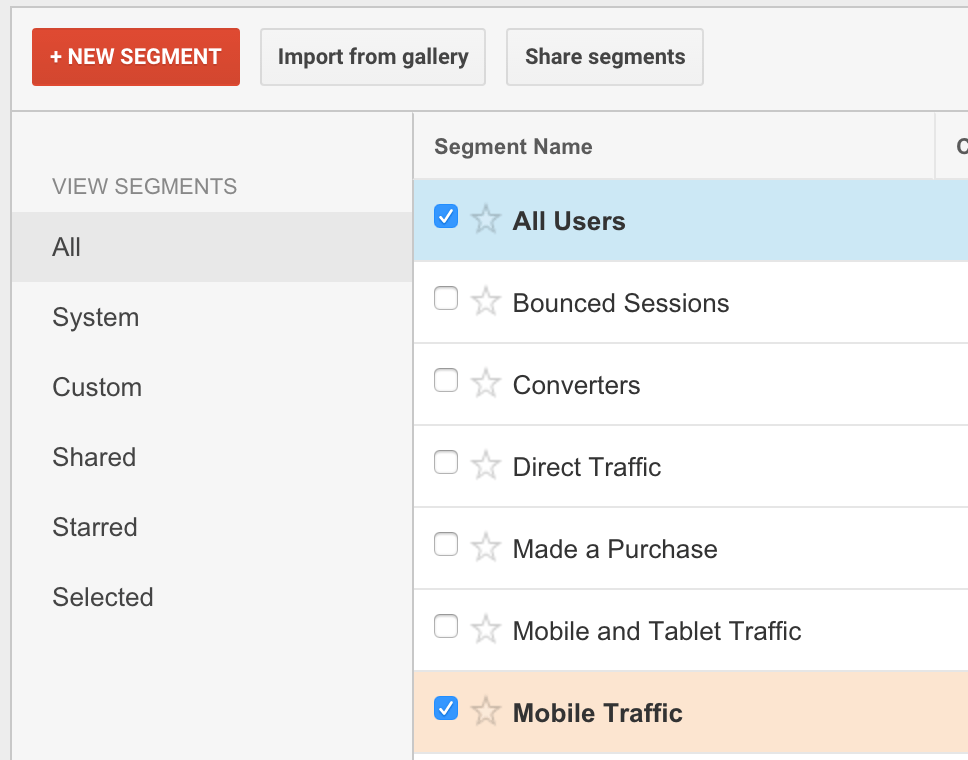
Google Analytics can track mobile visits separately from desktop, using a feature called segmenting. Using this feature, you can see how much of your traffic is mobile, where it’s coming from, and what pages are being viewed.
To enable a mobile segment, log into your Google Analytics account and go to Audience. Click where it says “Overview” (if it’s not there already) then click “Add Segment” towards the top of the page. This will show you all of your available segments, and you can choose “Mobile Traffic.”

You can uncheck “All Traffic” to see mobile only, or leave it checked for a comparison. Click the blue “Apply” button underneath the segments, and now you will see your new segmented data.
You should now be able to see the percentage of mobile-only traffic to your site, and you can click on other navigation items to see other data. For example, if I go to Behavior => Site Content => All Pages, I can see that my pricing page is the #1 visited page on mobile. I assume people are researching, and want to see how much my product costs.
With the mobile segment enabled, you can now compare different dates, and hopefully see increased engagement on mobile as you apply these optimization tips.
Conclusion
As mobile usage continues to grow, it’s critical that you improve the mobile experience on your website.
If you do nothing else, focus on speeding up your page load time for mobile users. It is by far the most important thing you can do. A responsive theme will help improve your site’s readability on small screens, but you should also consider designing a mobile-only experience. Don’t take features away from the site, just make sure your mobile visitors can find what they are looking for quickly.
A mobile app might be a great way to engage with your audience in a new way, allowing them offline access to your content and a more focused experience. Finally, make sure you track your progress with Google Analytics or another platform, because what gets measured gets done.
Two years back “Accelerated Mobile Pages” is not a matter, but nowadays AMP plays the main roll in Google ranking. This blog gives a lot of Tips for AMP.
Thank you for an informative blog Keep rocking and bring more blogs.