Atomic, Pagely’s control panel, has been through quite a few changes over the years. Since launching a complete overhaul of Atomic in 2018, it’s been through numerous feature additions, UI changes, and even a full company rebrand.
Today, we’re proud to show off the first phase of our end-to-end user experience improvements.
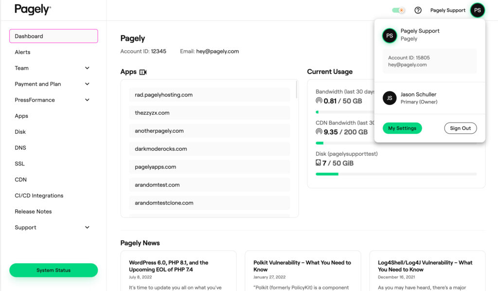
Clean, Modern, Accessible
Since day one, Pagely has always put an emphasis on helping our customers work with ease. Whether it’s handling your everyday maintenance and security needs, a tierless support experience that puts even your best in-house sysadmins to shame, or anything in between, we have your back.
We’re damn good at engineering solutions, but what happens when you have a bunch of top-tier engineers running the show? Your UX suffers – everything becomes “advanced mode”.
It’s time for a fresh coat of paint that reflects what’s under the hood.
By focusing on readability and accessibility, while maintaining a modern, attractive interface, we can truly show off the level of quality that Pagely is known for. We still have a lot of work ahead of us, but we’re off to a great start that you’re certain to fall in love with.
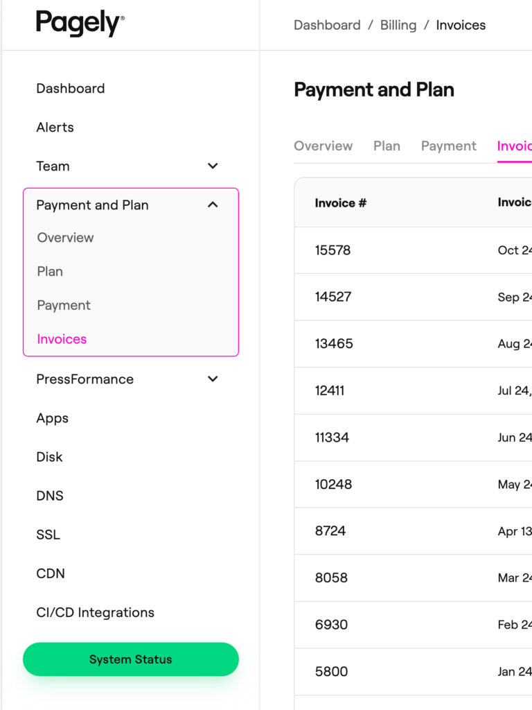
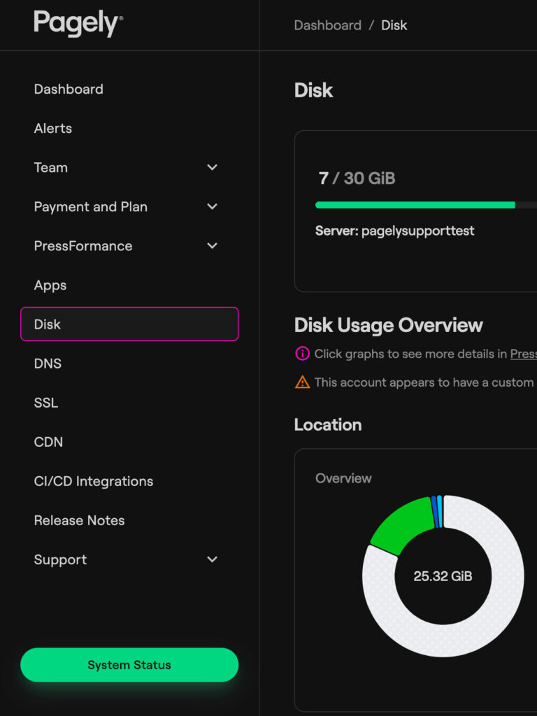
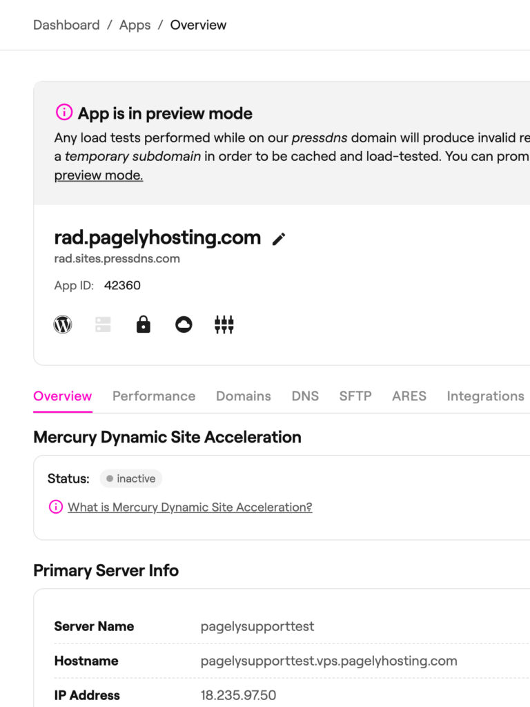
Step Into the Dark Side
If it wasn’t already apparent when we launched our new brand, we’re huge fans of dark mode.
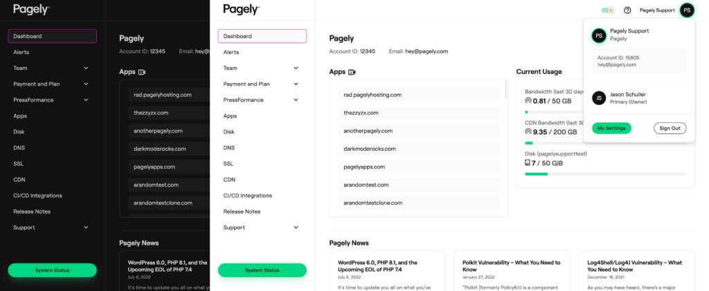
Although Atomic has supported light and dark modes for a while, we’ve made quite a few improvements that make your experience even better, regardless of which mode you prefer.
There are two kinds of people in this world – people who love dark mode and people who are wrong.
In all seriousness, both modes have their pros and cons. As we continue to improve the overall look and feel of Atomic, we’re putting significant consideration into both the aesthetic and accessibility advantages of different modes. Whether you choose dark mode to give your eyes a break from the daily onslaught of blue light or prefer light mode because of an astigmatism, we want to meet your needs – all while maintaining a consistent, stunning experience.
What’s next?
This initial update represents the start of an ongoing priority and effort for Atomic. As we move forward, we’ll be focusing on improving every touch point within Atomic, end-to-end.
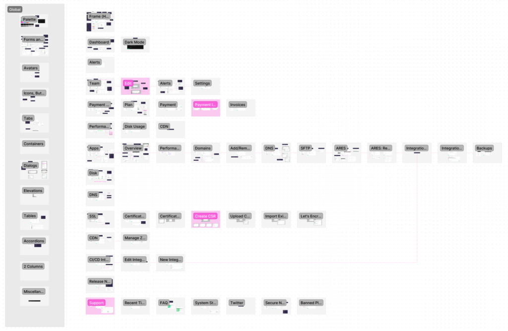
Over the next several design and development sprints, you’ll see a multitude of improvements – some minor, some major, all contributing to a breathtaking, accessible experience.
We Need Your Help
All the accessibility and isolated user testing in the world can never measure up to the value of raw, honest feedback. We’d love to hear your thoughts on the new changes, your individual needs, and experiences.
Together, we can create a revolutionary experience that delivers a beautiful experience, accessible to all.
Is there something you would love to see? Do you have special needs that we should consider? Hyped? Think it sucks? Let us know in the comments below or connect with us on Twitter.